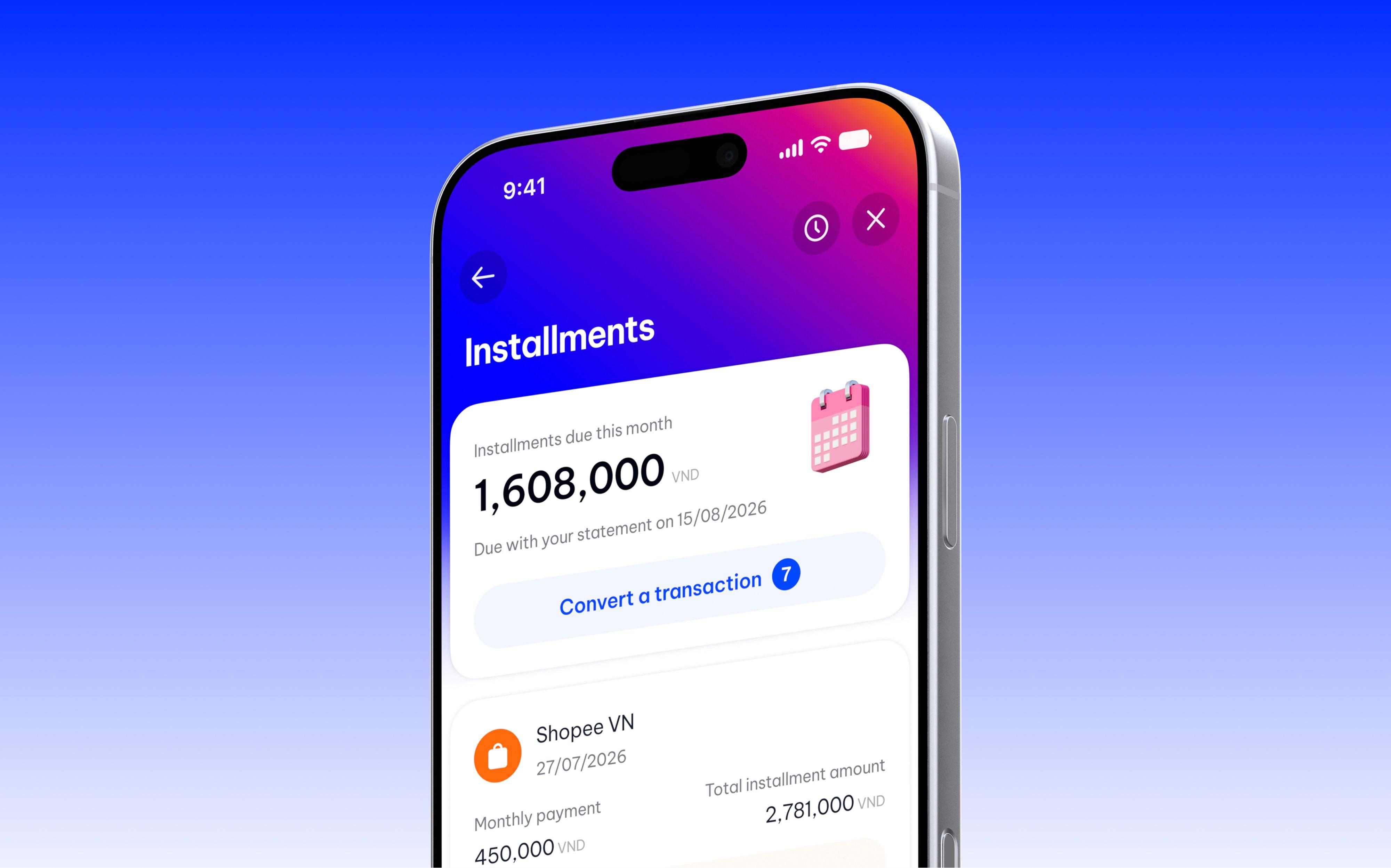
Vikki’s Installments feature lets cardholders convert a transaction into monthly installments and track the plan in the app. I worked with the PO to define the problem and map the user flow. I was responsible for the interface, interactions, and design system.
The feature has been released to customers. After leaving Vikki, I revisited parts of it on my own, focusing on how fees are explained and what cardholders see after applying. Captions identify the images from my personal redesign; there are no plans to release it.
Starting from the transaction
I often tell my friends about paying by credit card in installments. Some have a card but don’t know they can convert a transaction after making it. Others worry about interest and additional fees, or aren’t sure how much they would pay each month. I heard these concerns in informal conversations with fewer than 10 people. During the project, I did not interview or test with Vikki cardholders.
The PO and I considered placing the feature in the app’s general functions area or in card details. The general area was more visible but belonged to another team. We chose card details, where cardholders already view their card and transactions, accepting that people who didn’t know about the feature would have a harder time finding it.
The released version also has an entry point in transaction details. A line suggesting the monthly payment leads directly to term selection for that transaction. Cardholders can start from the purchase they’re viewing instead of finding the feature and selecting the transaction again.
Choosing a term also means choosing how fees are charged
On the plan selection screen, I placed the term and monthly payment on the slider, with fee information in the white panel below. The top is for choosing a term; the panel keeps the cost information just above “Continue”.
I considered chips and a slider, then chose the slider because I liked its appearance and the continuous feel of dragging it. This was a choice based on my own UI experience; I had no research showing that a slider works better than chips. During the project, I looked at VIB’s and UOB’s installment flows for comparison, but that did not determine the slider choice.
Moving from six to nine months also changes the type of fee. Shorter terms have a one-time conversion fee; terms of nine months or more have a monthly management fee instead. I made the fee panel change with the term so the information appears while the cardholder is considering a plan.
The slider has a limitation: to compare plans, cardholders have to drag through each stop. I added “Compare plans”, with a card for each term showing the monthly payment and fees. The cards form a carousel that can be browsed one at a time, and a plan can be selected there. The design then returns the cardholder to the slider at the selected term.
For transactions under VND 3 million, the PO required the slider to show only the three- and six-month stops, in line with the bank’s rules. With only two choices, dragging has less of an advantage. After the project, I considered using chips for this case. The current redesign still uses a slider; the chip option is not shown here.
Explaining fees from selection to confirmation
While designing, I wrote draft copy and handed it to the UX writer for the release version. My draft for transaction selection did not use “0%” and mentioned that fees could apply. The version after UX writing used “Select a transaction for 0% installment”, with fee information still shown below.
For the redesign, I read the public fee schedule and terms, then changed the wording to “zero-interest installment”, with “Fees vary by plan” below it. I wanted to make clear that there is no interest but fees still depend on the plan. I did this additional research after leaving the company; these were not documents I had when designing the released version.
That information continues into confirmation. I prioritised the monthly payment because the original transaction amount had appeared on earlier screens. For a plan with a monthly management fee, the label states that the payment includes the fee, while the fee is still listed separately. For a plan with a one-time conversion fee, the description says when it is charged.
In the redesign, I changed the conversion fee timing to when the plan is approved, replacing “charged in the first month”. I checked this wording against the public fee schedule, which says the fee is charged upon successful registration.
What does the cardholder see after applying?
In the released version, I prioritised “Convert another” to encourage another application. “View details” was still available as a link in the content. Looking back, I wanted viewing the newly registered plan to be the primary action.
On the redesigned dashboard, a newly approved plan shows 0/12 progress, the monthly payment, and the remaining amount. The overview above shows the amount due that month. A notice on the new plan’s card says the first payment will appear on the next statement. A pending plan has its own notice, while active plans have a progress bar. They sit in the same list, but each shows its own status.
For an unsuccessful application, the project version uses one shared screen, as agreed by the PO and tech team. In the redesign, I separated a technical error from a rejection: a technical error can be retried, while a rejection offers a way to select another transaction or contact support. The wording about fees and each status still needs to be checked against the system before implementation.
Handoff and reflection
I handed over the interface and string variables for the UX writer to refine, documented display rules for developers, and checked the build with QA. One issue I had asked to be fixed was still present in the build provided for comparison: content was clipped at the navigation bar while scrolling, where I wanted it to continue behind the bar.
The PO confirmed that the feature was released to customers. I did not take part in post-release measurement, but I followed up to ask about the data. The initial report did not establish the measurement period, metric definitions, and necessary exclusions clearly enough, so I have not used it to draw conclusions about the design’s effectiveness.
The personal redesign is currently a design only. I want to keep explaining costs while cardholders are choosing a plan, then make what happens after confirmation clearer. Before this version could be implemented, the messages about fees, plan status, and payment schedules would still need to be clarified with the PO, BA, and tech team. These changes have not been tested with cardholders.
Credits
The project was completed with the PO, BA, UX writer, developers, and QA. The redesign after leaving Vikki is my personal work.